


Reveal RISK
Your Way.
Your Way.
CyberProof’s CDC Reveal360 User Interface (UI) takes the experience of managing enterprises to a whole new level. Designed with a widget based customizable user interface layer, CDC Reveal360 caters for different personas who have different needs – a flexible UI canvas, customized Your Way.

The Data Hub for Cybersecurity & IT
An aggregation hub for all your cybersecurity, IT, GRC, and business needs

Customizable UI
Widgets
Customizable for CISOs, IT, Threat Analysts, Service delivery teams and more…

Inside-Out
Transparency
Transparent from inside the enterprise of how your cloud, cybersecurity infra and services are operating
Your Enterprise User Interface (UI) is Broken!
Most enterprises face product and solution sprawl, accompanies with an overload of user interface (UI) dashboards built for specific products or services. Threat intelligence lives in one tool, vulnerabilities in another, detection rules in a SIEM, asset inventory in a CMDB that's three months stale. When leadership asks, "are we protected against this ransomware group?" or "where should we spend our next security dollar?", answering takes hours of manual correlation. Furthermore, these UIs and dashboards are often designed for only certain persona workflows, which creates gaps in usability and forces rigid, sometimes irrelevant workflows on other users.
CDC Reveal360 offers a new approach to user experience by delivering a flexible and customizable interface built from modular set of UI widgets, allowing each persona to tailor the experience to their specific needs, while honing into the data that is relevant to them.
Manage Your Enterprise, Your Way.
CDC Reveal360 integrates with Cyberproof’s services to elevate “inside-out” security and IT insights about how your enterprise is performing from the perspective of:
- Overall Risk
- Specific exposure to threats
- Vulnerabilities exploitable on your assets (cybersecurity and IT estate)
- Your security services and defense controls and gaps
- Trends over time for measuring outcomes.
CDC Reveal360 is where people interact with CyberProof platform and service data. It’s a collaborative canvas where different stakeholders build and share dashboards.
- For managed service customers, CDC Reveal360 shows what CyberProof is doing: incidents handled, SLAs met, security posture trends, service metrics. They see the outcomes of the services delivered without needing to understand the underlying systems.
- For CTEM customers, CDC Reveal360 visualizes analysis from Interpres: threat-defense coverage gaps, exposure prioritization, estate visibility.
- For CyberProof co-managed SecOps teams, CDC Reveal360 is the operational interface where they track service delivery and demonstrate value.
CISO
- Challenges | Security posture data lives in multiple tools with no unified narrative. Board reporting is a manual exercise assembled from disconnected sources. The result often reflects point-in-time snapshots rather than the continuous program reality.
- What they see | Security posture summaries, investment priorities, board-ready reporting.
- Outcomes | Continuous, defensible security posture narrative. Board reporting that reflects continuous program reality rather than a snapshot in time. Reduced time assembling data from disconnected sources.

Threat Management Analyst
- Challenges | Insights from Interpres, threat intel platforms, and SOC tooling exist in silos. Building a holistic threat picture requires exporting, re-mapping, and rebuilding context outside the tools. There’s no collaborative surface for communicating findings to non-technical stakeholders.
- What they see | Threat-defense gaps, exposure analysis, coverage recommendations.
- Outcomes | Faster, richer threat assessments with full analytical context preserved. Ability to communicate findings to non-technical stakeholders without losing fidelity. A collaborative surface that keeps assessment work inside the platform ecosystem.

Service Delivery Manager
- Challenges | Value delivery happens continuously, but visibility into that work is periodic. Without a live shared view, customer perception of service quality depends almost entirely on quarterly reviews – creating a gap between what’s being done and what’s being seen.
- What they see | Customer health, service metrics, escalation status.
- Outcomes | Continuous customer visibility that replaces the perception gap between quarterly reviews. Shared workspaces that make ongoing work observable without additional effort. A more credible, transparent service relationship.

GRC / Compliance Lead
- Challenges | Compliance is simplified template-based checkbox documentation with no connection to which services and what controls are used to meet compliance.
- What they see | Compliance posture tied to multiple levels of verification to the actual service and controls providing that compliance. It is also continuous providing notification when no longer in compliance and where to fix.
- Outcomes | Unified view of operational performance and threat exposure. Earlier visibility into coverage gaps before they become incidents. Cleaner input for executive reporting.

Customer Security Lead
- Challenges | Receives curated reports that summarize rather than illuminate. Can’t explore the data behind conclusions or adapt views for different internal audiences without going back to the service team.
- What they see | Service visibility, exportable reports for internal stakeholders.
- Outcomes | Real understanding of what the service is doing and why – not a summarized version. Self-service access to security posture data for internal reporting. Confidence in the service relationship built on evidence, not trust.

Understanding Risk in Your Enterprise
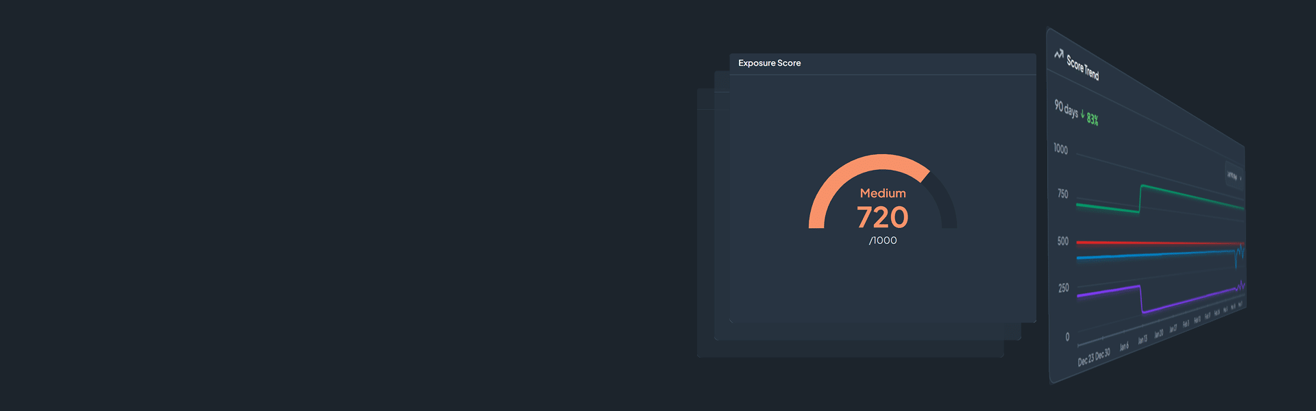
CDC Reveal360 provides a customizable canvas to express overall risk and categorized risk across assets, exposure and defense. Risk score trends can be viewed and reported over time to assess risk burndown goals and achievements in your enterprise.

The Exposure Score serves as a comprehensive indicator of an organization's overall exposure level. A higher score correlates with increased exposure and signifies a less favorable security posture for the organization. This score is derived from the amalgamation of the Threat Exposure, Defense Surface, and Fleet Exposure scores. Notably, the score is constrained within a range of 0 to 1000, providing a standardized metric for evaluating and benchmarking security resilience.
The Fleet Exposure Score is a score between 0 and 1000 representing the exposure of an organization’s assets. The score is primarily derived from the number and severity of the actively exploited vulnerabilities on an organization’s assets. This score changes frequently and maintaining a low score generally requires an organization having good patch management.

The Defense Surface Score is a score between 0 and 1000 representing the defenses an organization has against the prioritized threats. The score is increased based on the known detections, current visibility, and active controls. This data is provided by an organizations integrations and manually uploaded content.

The Threat Exposure Score is a score between 0 and 1000 representing the inherent risk a specific organization faces from adversaries. The higher the score the greater the overall threat exposure and risk an organization faces from adversaries.

CDC Reveal360 Platform Features
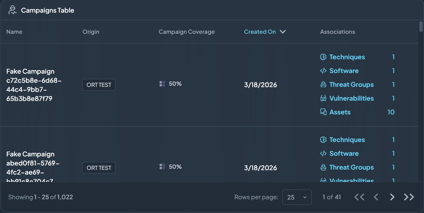
- Campaign Tables | Lists all threat campaigns, how well your enterprise is covered and what those campaigns are associated within your enterprise
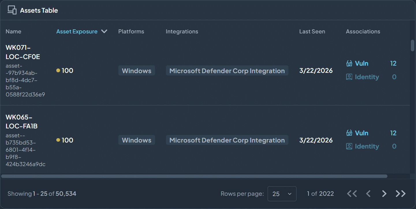
- Asset Tables | Lists all your estate (asset) within your enterprise, how much they are exposed and what vulnerabilities are associated with them
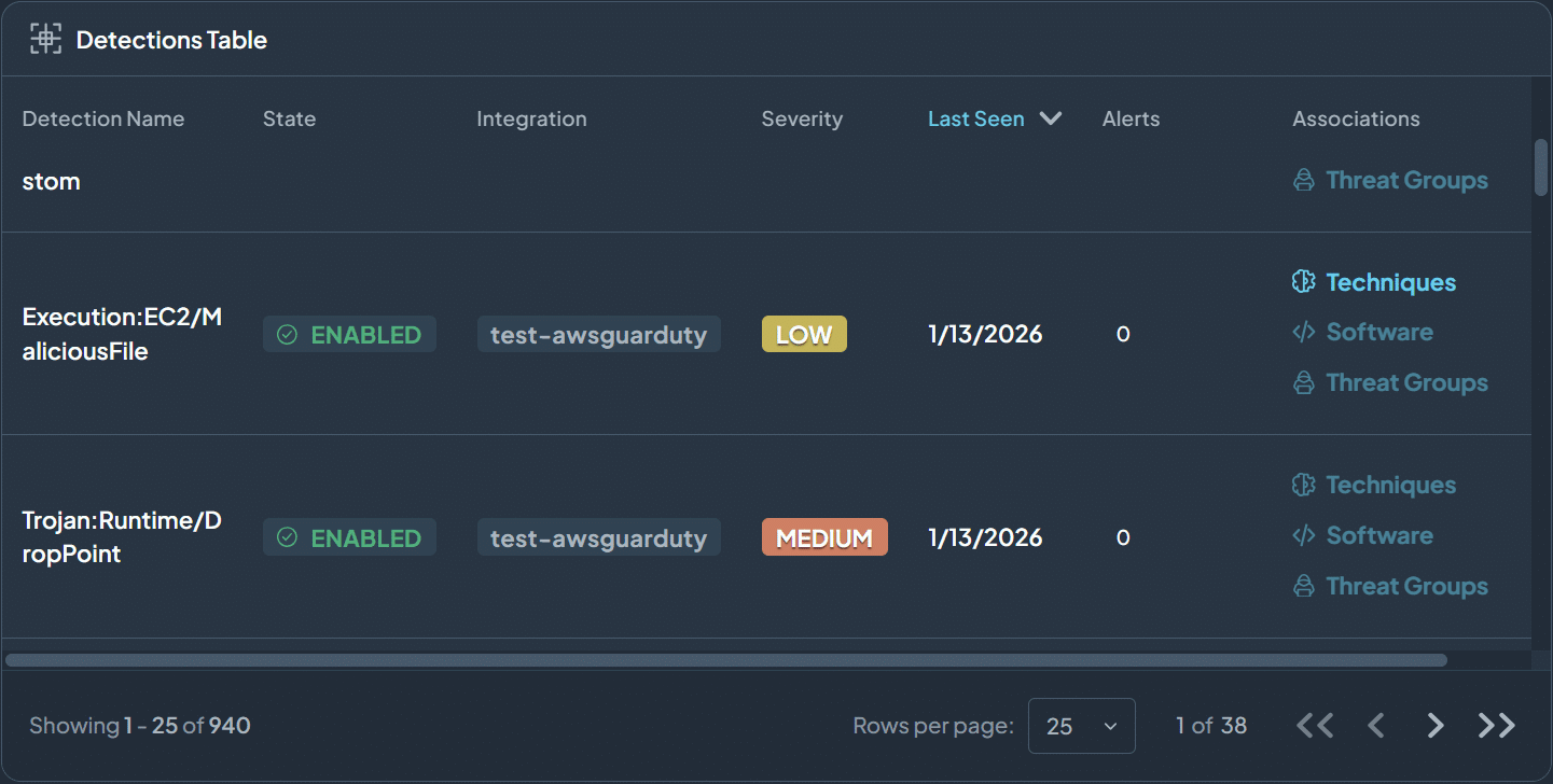
- Detection Tables | Lists all enterprise detection rules that are available for protecting your enterprise
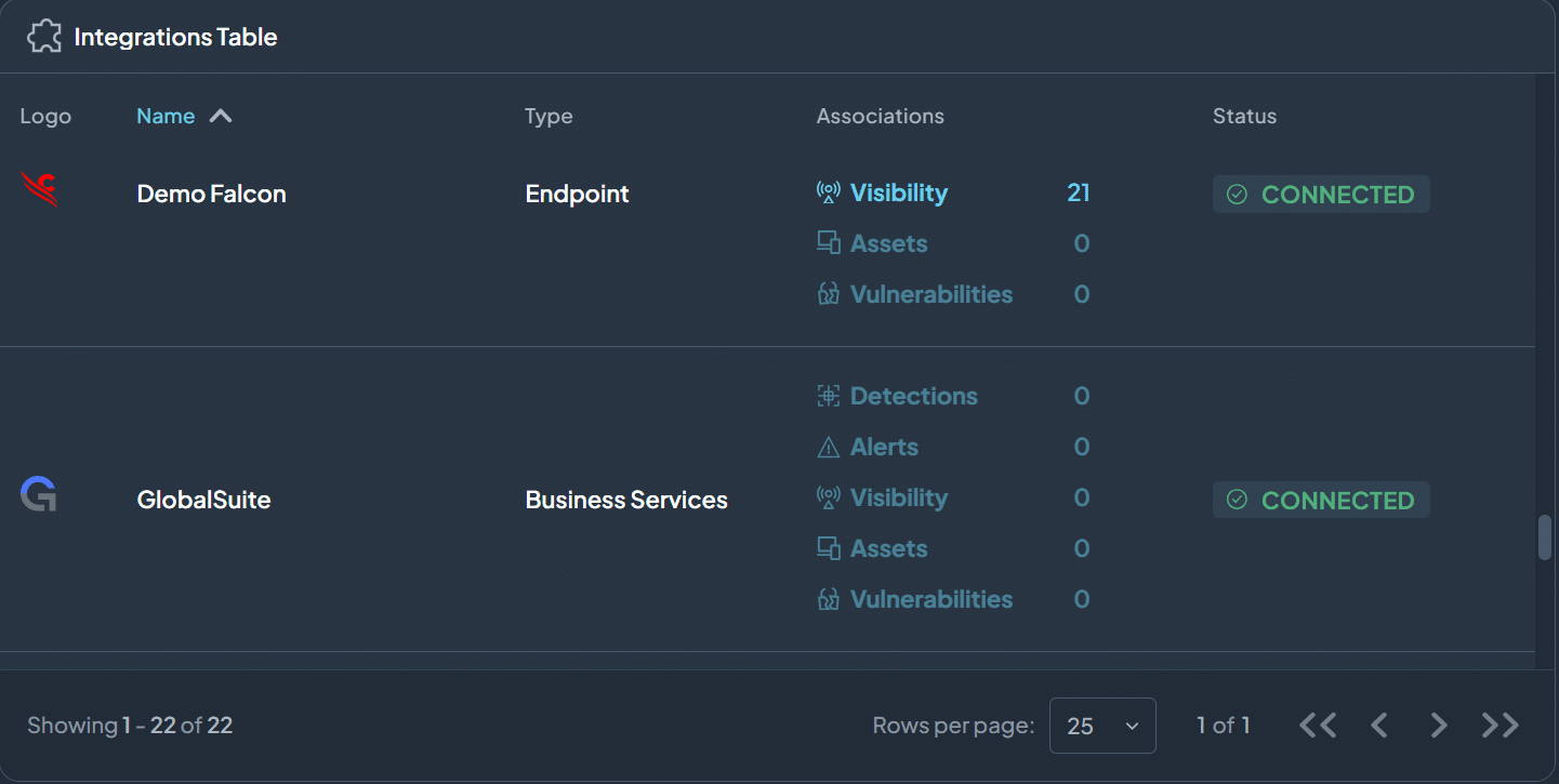
- Integrations Tables | Lists integrations, including vendors, CDC Reveal360 is connected. Provides visibility what level of alerts, and vulnerabilities these integrations are reporting